

The Arc of Northwest Wayne Country - Lekotek Program
Streamlined the non-profit’s toy lending program to a digital application and database, for both families and administrators usage.
Project Context:


Role: UX researcher, UX/UI designer
Team: Priya Ganji, Alan Yang, Stella Young, Woojin Kang
Timeline: August 2023 - April 2024
Tools: Figma, Miro, Google Suite
Toys can get very expensive, and the Arc of Northwest Wayne County tries to solve this through their Lekotek program. This program allows families to borrow developmentally appropriate toys from their 3,000+ toy warehouse and return them during monthly play sessions. After each session the toys are cleaned and put back on the shelves for more families to benefit from. This allows the children to have engage with more toys, giving them a sense of newness every few weeks.
Overall, promoting new discovery of toys for the children, and promote inclusive play by ensuring all children have equal access to engaging and adaptive toys.
Context:
Bridging Families & Toys Through Toy Lending.
Covid highlighted crucial inefficiencies to the program, with families not being able to come in to access the toys to everything being done in pen and paper. A single excel sheet being used for record keeping to no method for tracking a toy’s location.
With more families willing to join the program and more locations wanting to expand the offering, it is clear the program is not sustainable and manageable on a large scale.
Problem:

A two sided problem


3,000+ Toys & Declining Family Participation
Research:
Ideation & Design:
The four main research methods utilized:
1. Interviews
We conducted interviews with current administrators and families. We recognize there may be a bias here, yet this was the extent of our scope. With administrators we found the struggles they faced with efficiency, especially with the keeping track of each toy and it’s whereabouts. With the families we saw what they liked about the program and some of the frustrations they had.


2. Contextual Inquiry
Visiting the Arc in person allowed us to see the environment in person. How families interact with the toys first hand, how the program is organized and run, and lastly the areas of improvement for the program. We made sure to take lots of pictures for later analysis.

The toys are organized by shelf for their separate developmental needs.
3. Affinity Diagrams
The color-coded diagraming of data from all our interviews, contextual inquiry, and photos taken helped us see the information we had in one place. We grouped the sticky notes into common recurring themes like “Difficulty in toy return process”. This directed our approach in the next part of the project.

After conducting interviews, contextual inquiry and interviewing families and administrative members, we identified these three themes.

4. User Journeys
To better understand the the users, we developed two user journeys, one for the administrators, and one for the families.


Design for Families vs Administrators
Figuring out the requirements for each of the user groups, we created a UX requirements spreadsheet. We divided them into three different priorities to recognize how we might identify the first round scope of our wireframe, leaving the rest to further iterations in the future.

We realized we have to design two different user portals. One designed for families while the other targeted towards administrators. These are four different pages we identified for each user.
Families

Administrators

We realized we have to design two different user portals. One designed for families while the other targeted towards administrators. These are four different pages we identified for each user.

Stylization:
Wireframing:
Branding
We used inspiration of the Arc logo, and it’s bright opposite colors to complement the orange. We kept in mind accessibility in terms of colors and size of the fonts as well.


Low-fidelity
We each individually ideated what we thought the dashboard should look like, leading to the low-fidelity version of our application. We used inspiration from other platforms like Spotify and Amazon, to guide our initial designs.

Mid-fidelity
Next, we used Figma to put all the screens together, before adding any images and stylized icons.


Here is the examples of the lending history(family), family profile database(admin), and toy checkout process(admin)
High-fidelity
Through ongoing client meetings and collaborative team discussions, we iteratively refined our designs to align with both the administrators’ need for efficiency and organization and the families’ desire for intuitive discoverability.
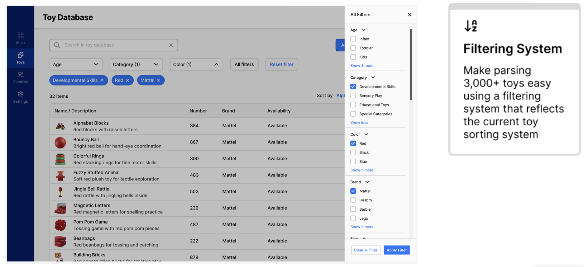
The administrator-facing platform features a custom filtering system modeled after their existing toy categorization process, along with a visual table-style database, progress indicators, and error prevention tools, all aimed at streamlining workflows and reducing manual strain.

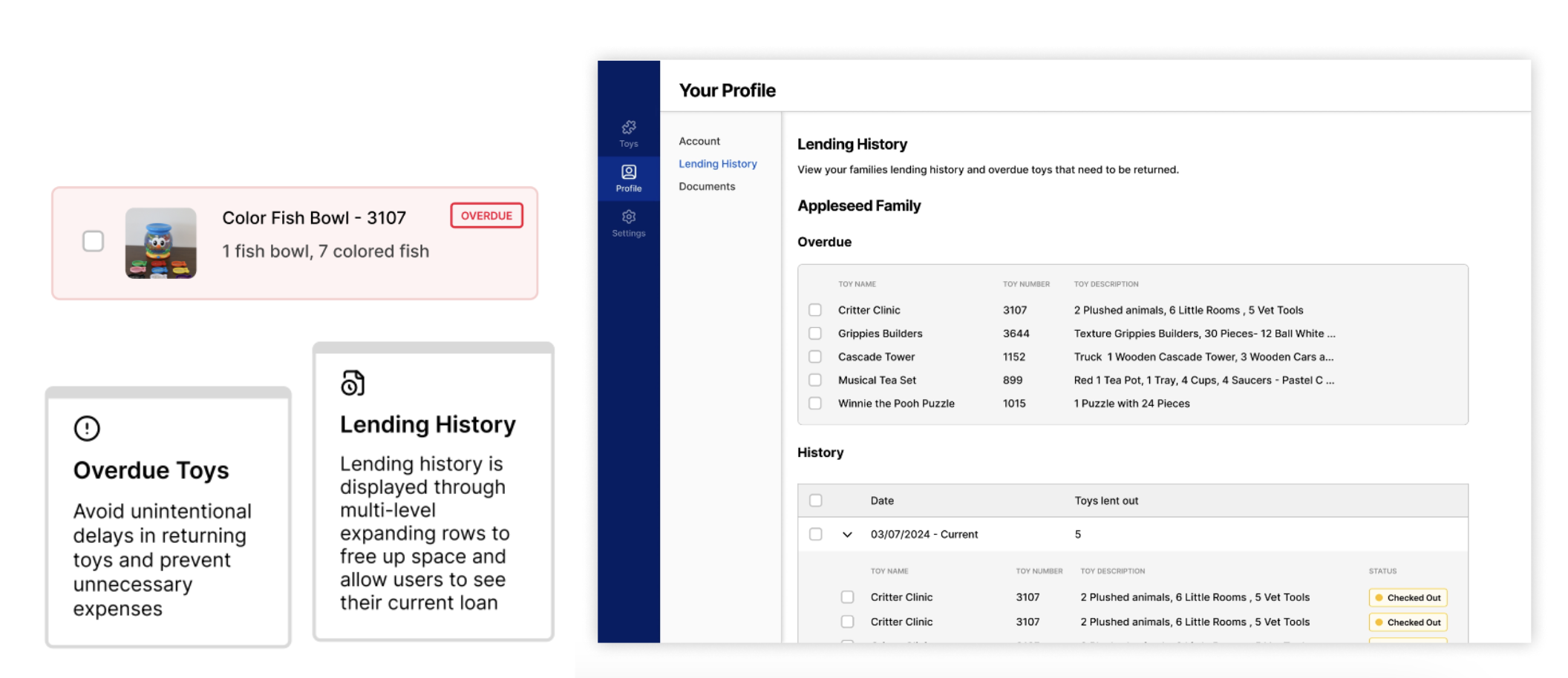
On the family-facing side, we designed the platform to highlight overdue toys, provide easy access to lending history, enable personalized toy discovery, and include clear status indicators for toy availability.

Testing:
Usability Testing:
To evaluate the effectiveness of our design, we conducted usability testing sessions with both families and administrators. Participants were asked to complete a series of tasks using our prototype, each aimed at addressing previously identified pain points.
After each task, users rated their experience using the Single Ease Question (SEQ) on a 5-point scale (1 = very easy, 5 = very difficult). Upon completing all tasks, they completed the System Usability Scale (SUS) to assess the platform’s overall usability and learnability.
The results were promising:
SUS scores exceeded 90 for both user groups, indicating high usability
All SEQ scores were below 2.5, with an average of 1.63, reflecting ease of use across tasks
For the administrator group, we also tracked average task completion times to measure efficiency gains. Compared to the manual paper-based process, the new digital system significantly reduced time spent on toy checkouts and returns, highlighting the impact of a well-designed interface.


Reflections:
Community Impact:
This online application facilitates:


Final Thoughts:
One of the biggest challenges we faced was designing fro two distinct user groups with unique goals, pain points, and frustrations. We took what was once a dense, data-driven, paper-based system and converted it into a thoughtful and easy-to-use digital application. This was both a technical and intellectual challenge.
Through interviews and contextual inquiry, we were tasked to balance the importance of in-person interactions with the effectiveness of a digital solution. Hence, we focused on scalability to ensure an intuitive and experience for the administrators, while focusing on simplicity and aid for the families
Our work was recognized with 2nd place in the Community/Civic Engagement category at the University of Michigan’s design exposition - a proud milestone for our team. Looking ahead, we’re excited to see our designs enter the development phase and even more proud to contribute to The Arc of Northwest Wayne County’s mission of empowering children with the Lekotek program.
Project poster below:

Future Recommendations:
Two key features that could be used for future implementation include:
